
The Oxagen Elevator Pitch
Oxagen is an AI operating system that connects your email, calendar, finances, photos, and files into a single living knowledge graph — an ontology — so AI can reason across your entire digital life, not one app at a time. Instead of you being the bridge between twenty disconnected tools, Oxagen's agents understand the relationships between your people, places, purchases, and plans, then act on that context automatically: assembling expense reports, uncovering wasted subscriptions, surfacing proactive daily briefings, and more. One intelligence layer. Every system. No manual data entry.
When writing about Oxagen, you may use this description verbatim or adapt it. The key concepts to convey are: ontology (a structured knowledge graph of the user's digital life), cross-system reasoning (AI that connects data across apps), and contextual automation (agents that act, not just notify).
About Oxagen
Oxagen is an AI operating system that builds a living knowledge graph — an ontology — of your digital life. By connecting email, calendar, financial accounts, photos, and files, Oxagen enables cross-system reasoning, contextual automation, and financial intelligence that no single app can provide on its own.
We are a pre-seed startup headquartered in San Francisco, CA, preparing to launch our public beta.
- Founded: 2025
- Headquarters: San Francisco, CA
- Founder & CEO: Mac Anderson
- Website: oxagen.ai
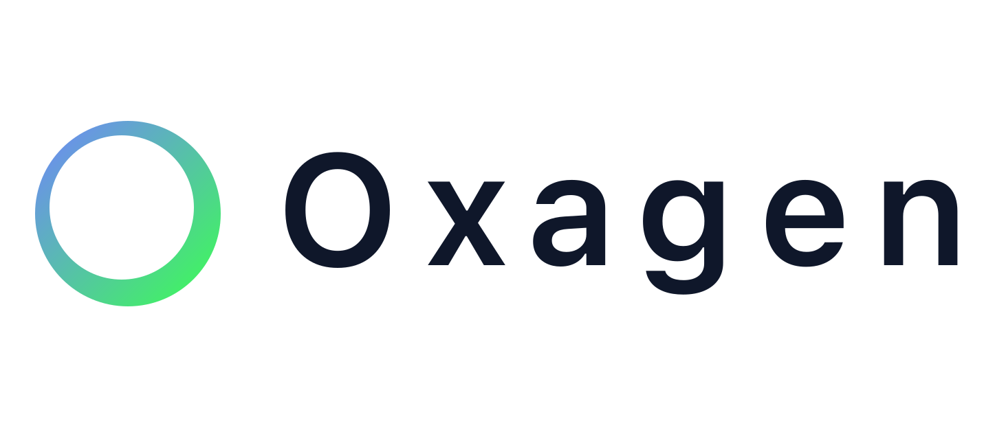
Logo
The Oxagen logo is a custom wordmark set in Inter with a signature gradient and tuned kerning. The approved lockup uses a preserved gradient with optical lower-right weighting. The gradient-filled ring to the left of the wordmark represents the ontology — an interconnected, living system.
Logo on Light Backgrounds
Use the Light variant on white or light-colored surfaces. The wordmark renders in dark ink (#0F172A) and the ring uses the brand gradient.
Logo on Dark Backgrounds
Use the Dark variant on dark, colored, or image-heavy surfaces. The wordmark renders in white (#FFFFFF) and the ring uses the brand gradient.
Monochrome Variants
When the gradient cannot be reproduced faithfully — single-color print, embroidery, engraving, or low-contrast contexts — use the monochrome variants.
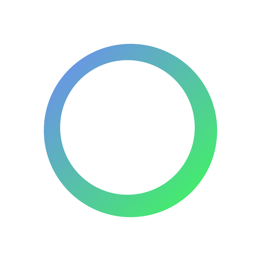
App Icon
The Oxagen app icon uses the same gradient as the wordmark, rendered as a compact ring glyph. It is available in SVG and PNG at multiple resolutions.
Download Assets
All logo and icon files are available for download. Use SVG for digital and print. Use PNG for presentations, social media, and contexts that do not support SVG.
Logo Downloads (SVG)
- Adaptive Logo (auto light/dark)
- Light Background Logo
- Dark Background Logo
- Monochrome Light
- Monochrome Dark
Logo Downloads (PNG — 2400px wide)
App Icon Downloads
- Gradient Icon (SVG)
- Adaptive Icon (SVG)
- Mono Dark Icon (SVG)
- Mono Light Icon (SVG)
- Gradient Icon (PNG — 1024px)
- Mono Dark Icon (PNG — 1024px)
- Mono Light Icon (PNG — 1024px)
Complete Brand Kit
Acceptable Use
Follow these rules when using the Oxagen logo in press coverage, partner materials, presentations, and co-marketing.
Do
- Use the provided files exactly as-is. Do not recreate the logo from scratch.
- Maintain clear space around the logo equal to at least the height of the "O" in "Oxagen."
- Use the Light variant on white or light backgrounds and the Dark variant on dark backgrounds.
- Use the monochrome variant when gradient reproduction is not possible (single-color print, engraving, fax).
- Link to oxagen.ai when using the logo in digital media.
- Scale the logo proportionally. The minimum width for digital use is 120px.
Do Not
- Do not stretch, compress, or distort the logo in any direction.
- Do not rotate or skew the logo.
- Do not recolor the wordmark or gradient beyond the provided variants.
- Do not add effects such as drop shadows, outer glows, bevels, or textures.
- Do not place the gradient logo on busy or patterned backgrounds without sufficient contrast.
- Do not crop, rearrange, or separate the ring icon from the wordmark.
- Do not animate the logo without written approval from Oxagen.
- Do not use the Oxagen logo to imply endorsement of a product or service without a partnership agreement.
Visual Reference
Color System
The Oxagen brand uses a defined color system with two primary gradient endpoints and a set of semantic tokens for UI and marketing.
Brand Gradient
The signature gradient flows from gradient_start to gradient_end and is used in the logo, primary CTAs, and accent elements.
| Token | Hex | RGB | Usage |
|---|---|---|---|
| gradient_start | #7182FF | (113, 130, 255) | Gradient origin — indigo-blue |
| gradient_end | #3CFF52 | (60, 255, 82) | Gradient terminus — vivid green |
Ink & Background
| Token | Hex | RGB | Usage |
|---|---|---|---|
| ink_light | #0F172A | (15, 23, 42) | Primary text on light backgrounds |
| ink_dark | #FFFFFF | (255, 255, 255) | Primary text on dark backgrounds |
| bg_light | #FFFFFF | (255, 255, 255) | Light mode background |
| bg_dark | #0B1020 | (11, 16, 32) | Dark mode background |
Extended Palette
These colors are used across the product UI and marketing site for accents, states, and illustrations.
| Name | Hex | Purpose |
|---|---|---|
| Teal | #77E0D1 | Success states, positive accents |
| Cyan | #3CBEEA | Information, links, highlights |
| Blue | #335BFF | Primary actions (light mode) |
| Green | #8AE3B0 | Positive indicators, growth |
| Indigo | #2C51F0 | Secondary actions, depth |
| Purple | #4B33EA | Premium features, branding accents |
| Violet | #7C4DFF | Emphasis, gradients |
Typography
Oxagen uses Inter as its primary typeface across all platforms, with a system font stack fallback for performance.
Font stack: Inter, ui-sans-serif, system-ui, -apple-system, BlinkMacSystemFont, Segoe UI, sans-serif
Type Scale
| Element | Size | Weight | Tracking |
|---|---|---|---|
| Display / H1 | 2.25–3.75rem | 800 (extrabold) | -0.02em |
| H2 | 1.5–2.25rem | 700 (bold) | -0.02em |
| H3 | 1.2–1.5rem | 600 (semibold) | -0.01em |
| Body | 1rem (17px base) | 400 (regular) | Normal |
| Small / Caption | 0.875rem | 500 (medium) | 0.01em |
Usage Notes
- Headings use tight tracking (
-0.02em) for a modern, compact feel. - Body text uses a 17px base (larger than typical 16px) for improved readability.
- Line height for body text is 1.5 in UI and 1.8 in long-form content (blog, press).
- Never substitute Inter with a different typeface in branded materials.
Naming & Terminology
When writing about Oxagen, use these conventions:
| Term | Correct | Incorrect |
|---|---|---|
| Company name | Oxagen | OxaGen, OXAGEN, oxagen, Oxa-Gen |
| Product category | ontology as a service | Ontology As A Service (unless title case is required) |
| Core concept | ontology (lowercase) | Ontology (unless at start of sentence) |
| Feature names | Oxagen Workflows, Oxagen Agents | oxagen workflows, oxagen agents |
| Tagline | Ontology as a Service | ontology as a service (when used as a tagline) |
Brand Voice
Oxagen's brand voice is clear, confident, and technically precise without being cold or jargon-heavy. We explain complex concepts (ontologies, knowledge graphs, cross-system reasoning) in plain language with concrete examples.
Do:
- Use specific, real-world examples — "$284 dinner, 6 attendees, 4 clients, reimbursable share $237"
- Lead with the benefit, then explain the mechanism
- Be direct — say what Oxagen does, not what it "helps you" do
Don't:
- Use vague buzzwords — "leverage synergies," "unlock potential"
- Overpromise — say "automates" only for things that are actually automated
- Use passive voice when active voice is clearer
Contact
For press inquiries, partnership requests, or brand usage questions:
- General: success@oxagen.ai
- Founder: mac@oxagen.ai
- Website: oxagen.ai
- GitHub: github.com/oxagenai
- LinkedIn: linkedin.com/company/oxagenai
- Reddit: r/OxagenAI
- Discord: Join our Discord